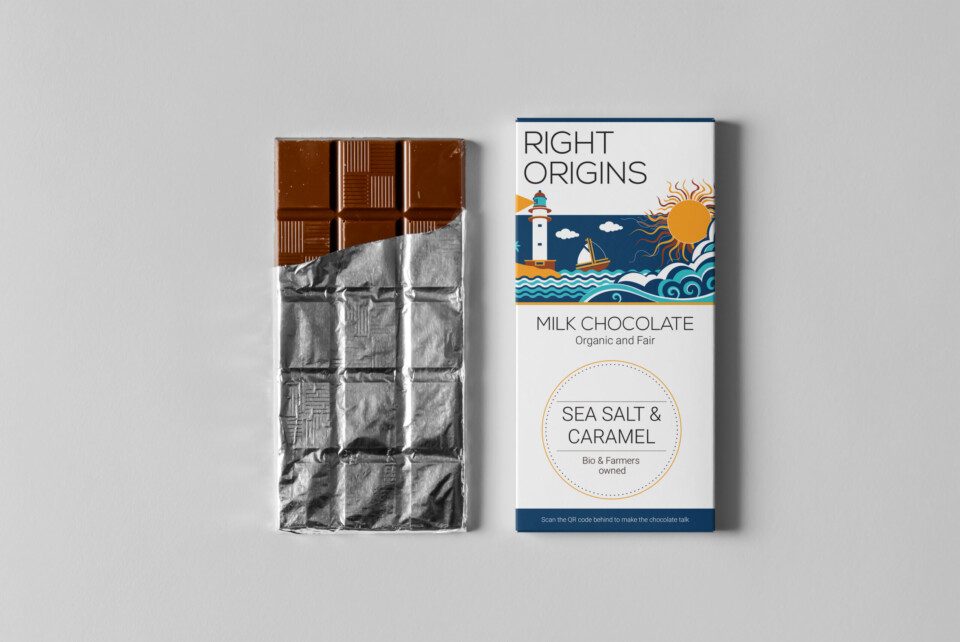
Right Origins
The Style
I have tried using an illustration style that is modern, minimalistic and which is easily communicated to the consumers of all age groups.
Pomegranate-Dark chocolate and Caramel-Sea salt are the two flavours introduced. I have created simple illustrations representing the particular flavours that the customers could easily relate with. The colour schemes and palette used is in accordance with the respective flavours which makes the package design quite unique and appealing to the eyes, which helps to catch attention of the customers wherever the chocolates are placed.
Design Rationale
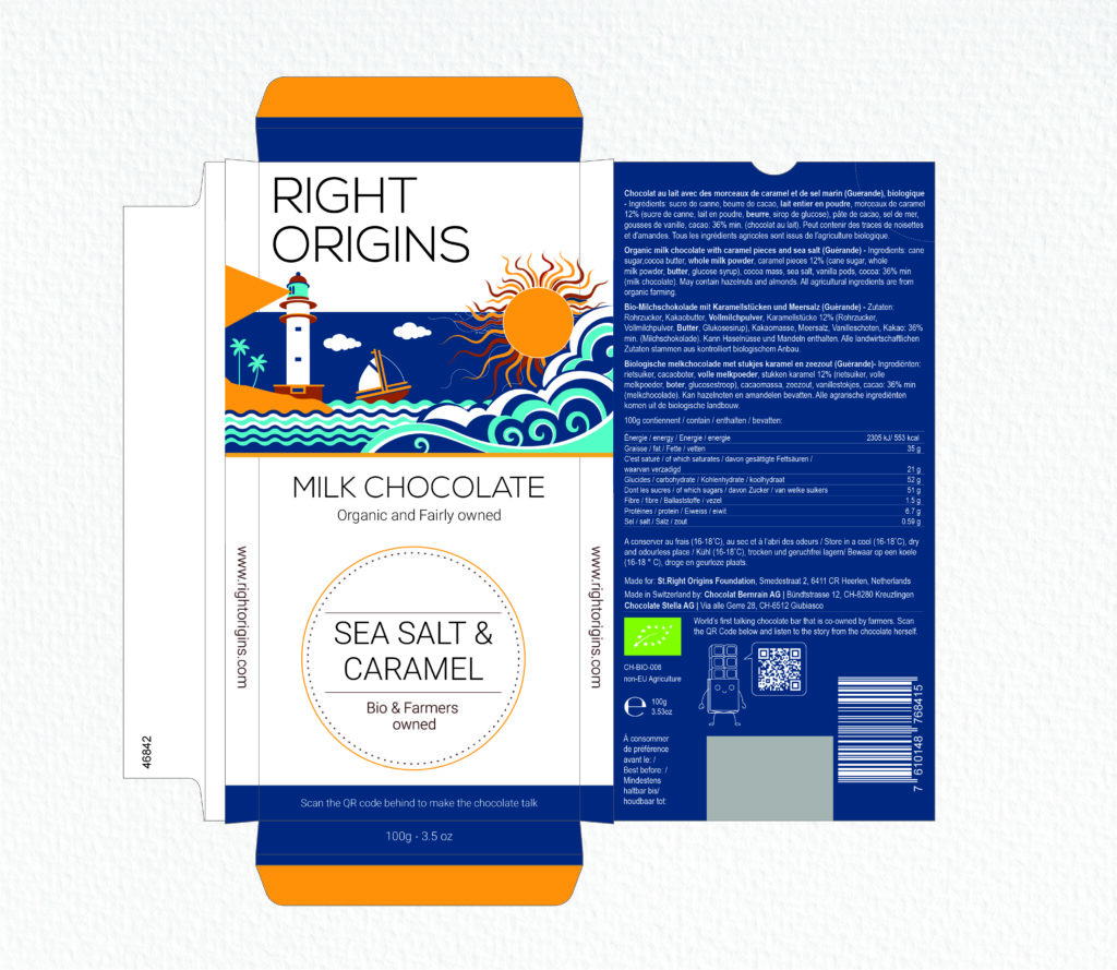
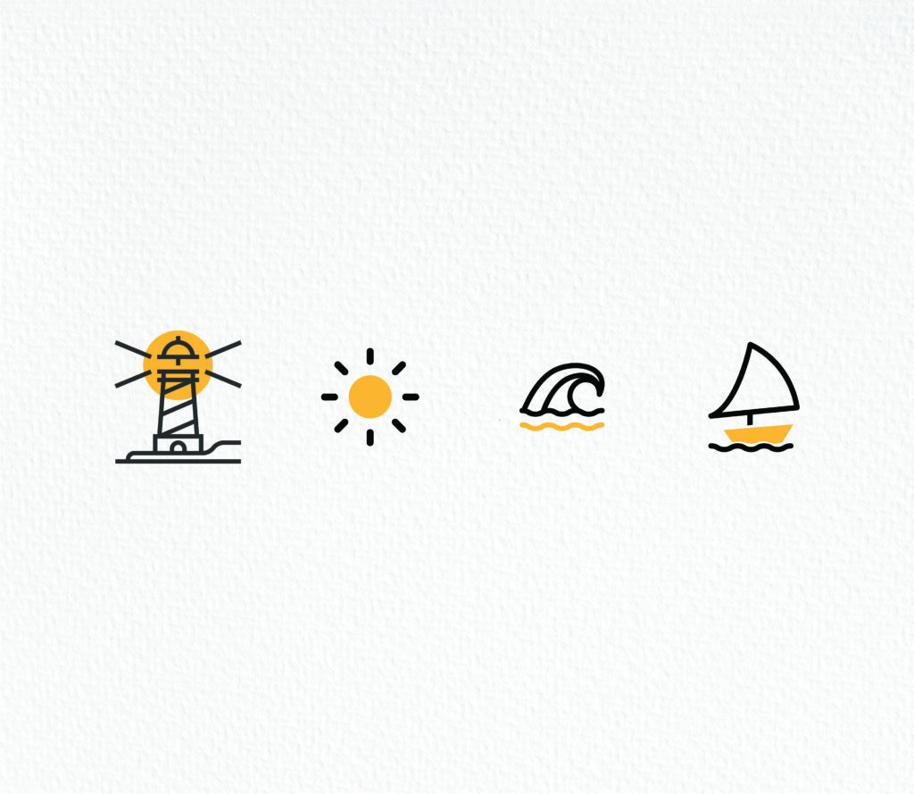
The Caramel sea salt flavour shows a sailboat sailing through the waves, the sun and the light house. The colour scheme uses earthy colours like shades of blue,brown and yellow ochre showing justic to the flavours used that is Caramel and sea salt. The ues of brown and yellow are specially used to depict the golden caramel and the bluish tone for the sea salt. The overall illustration gives a pleasant andbright feel which exactly does justice to the flavours used. The elements used in illustration is very simple and is communicated aesthetically and clear to the customers.
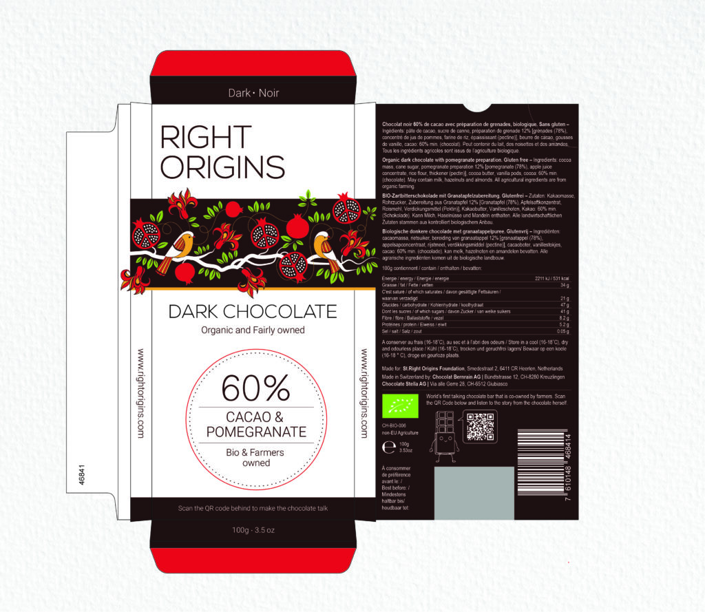
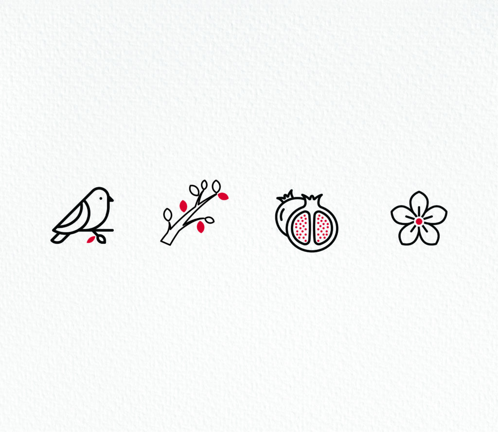
The pomegranate dark chocolate flavour shows a tree bark with pomegranate, flowers and birds. The colour scheme uses earthy colours like shades of red, brown, green and yellow ochre showing justic to the flavours used that is organic pomegranate granules and 60% dark chocolate. The design stands close to nature by incorporating elements like birds, flowers, pomegranate therby bringing out the organic element in it which is communicated aesthetically and clear to the customers.
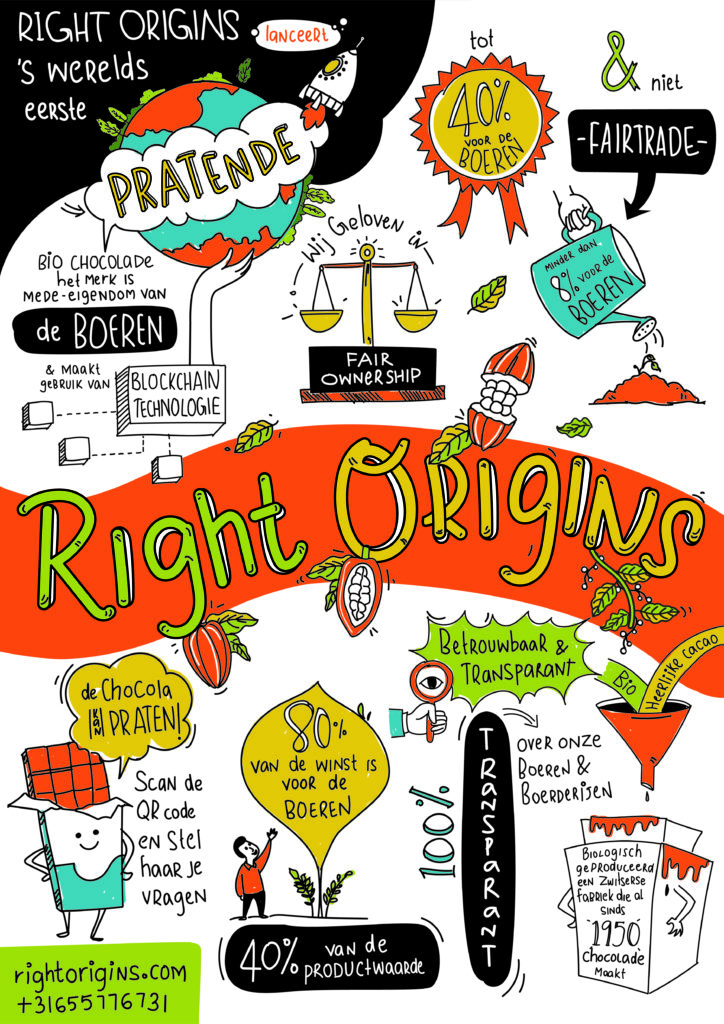
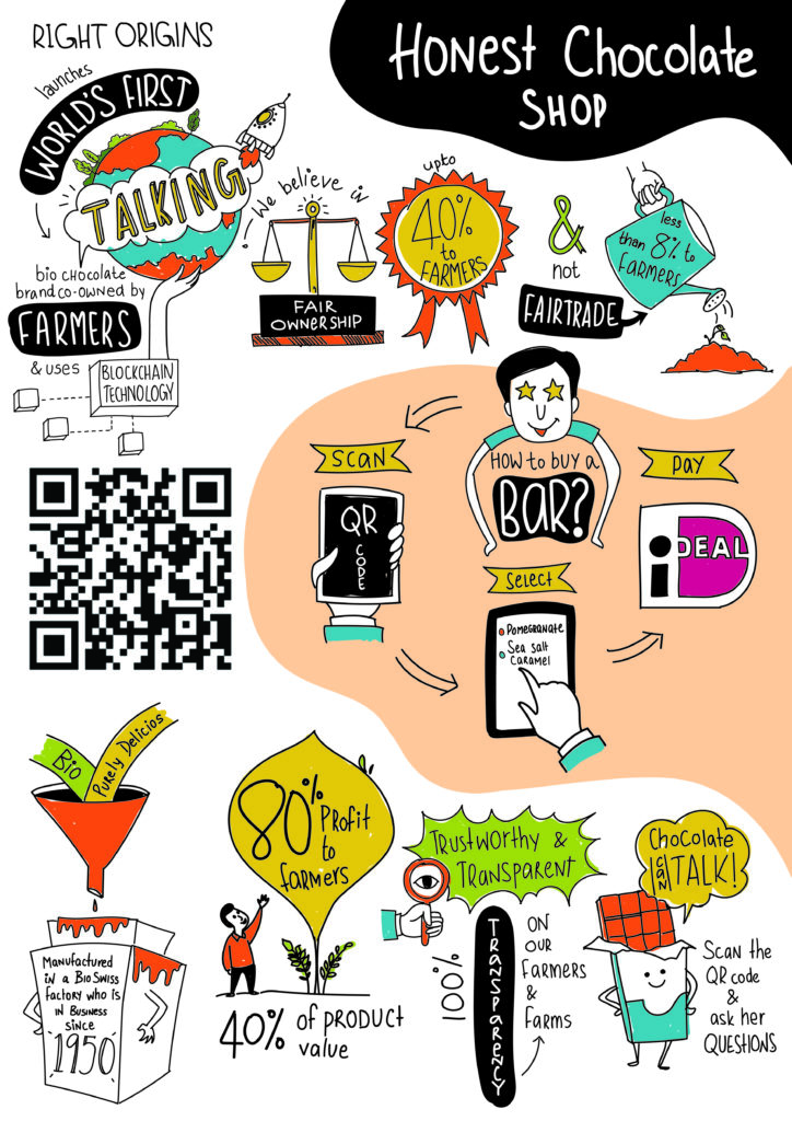
Infographic Posters (Print)
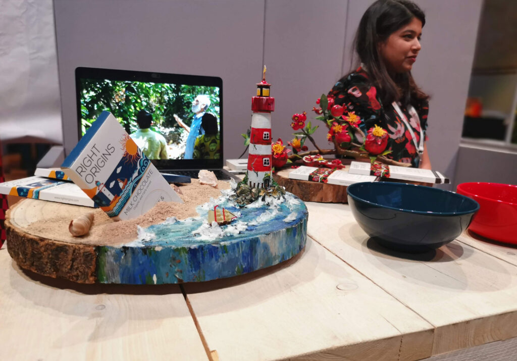
3D Models
I created 3D models of the product and its design inspiration to be used in a chocolate fair in Amsterdam. This was useful to make the Right Origins stand in the exhibition hall more fun and attractive.
